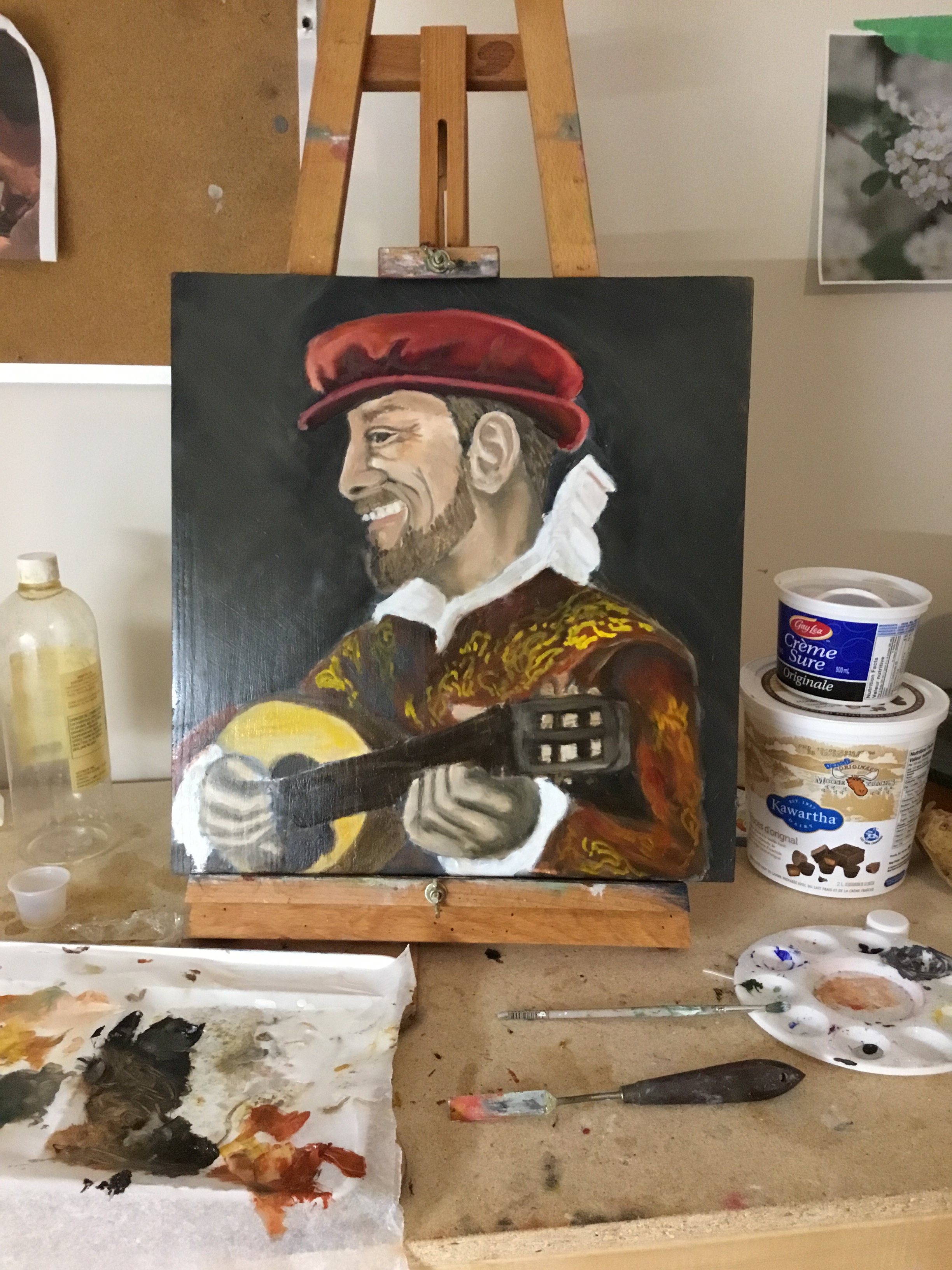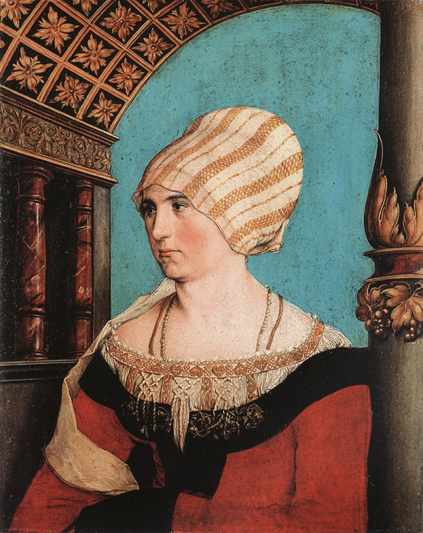
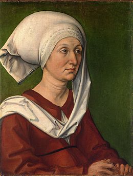
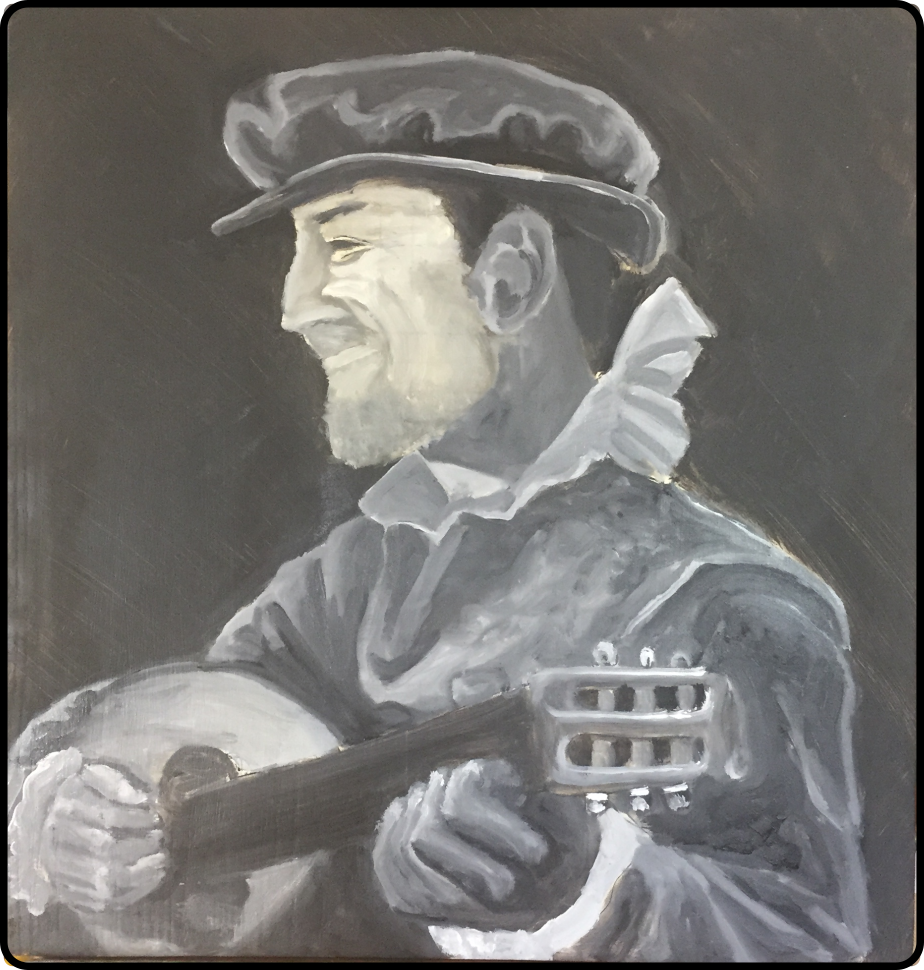
Dorothea Kannengiesser wife of Jakob Meyer, by Hans Holbein the Younger, 1516
Project entered in the Kingdom of Ealdormere Arts and Sciences Competition, 2016
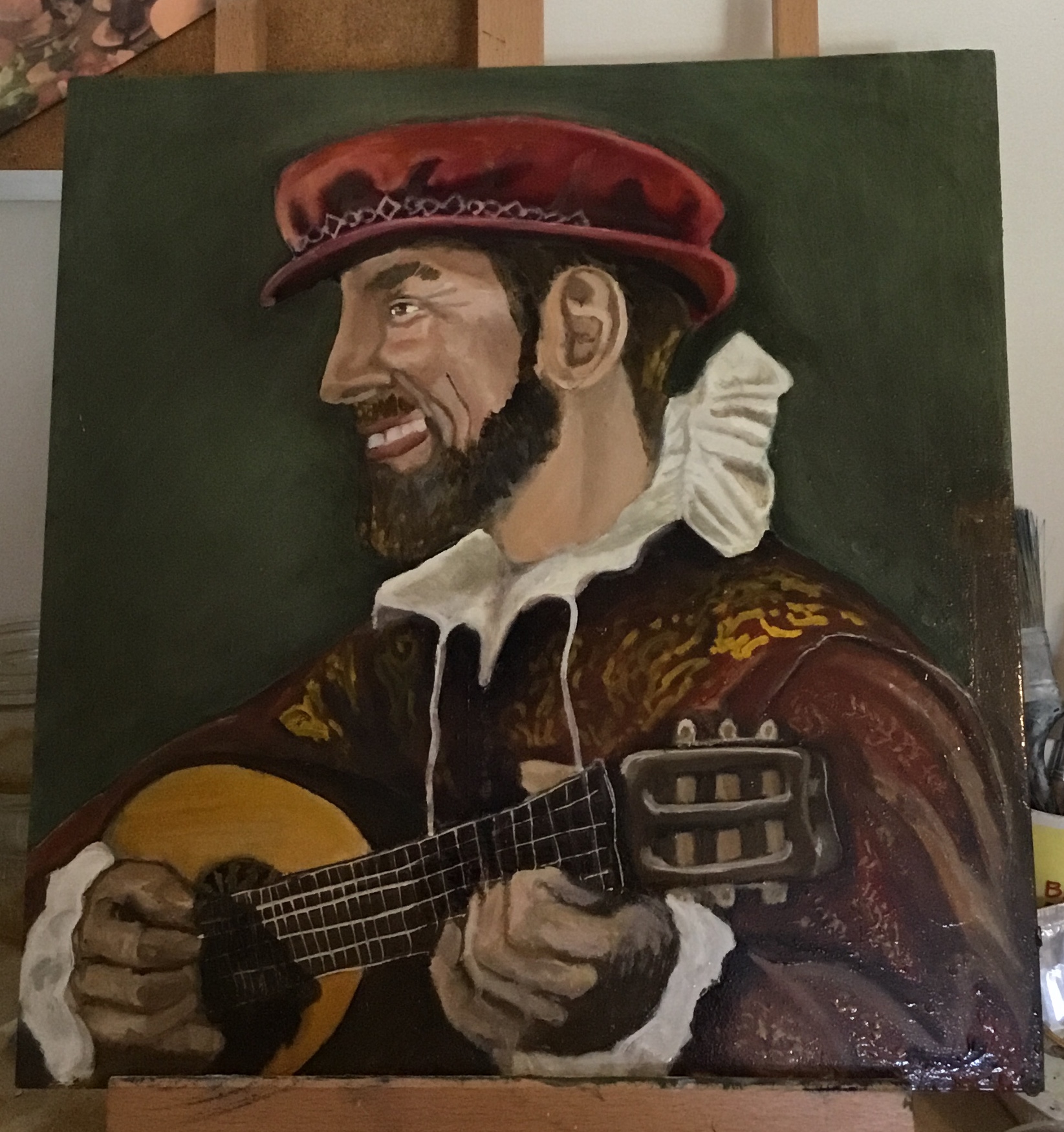
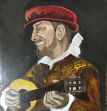
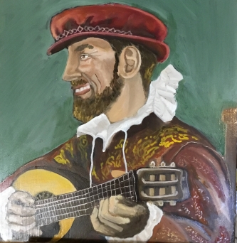
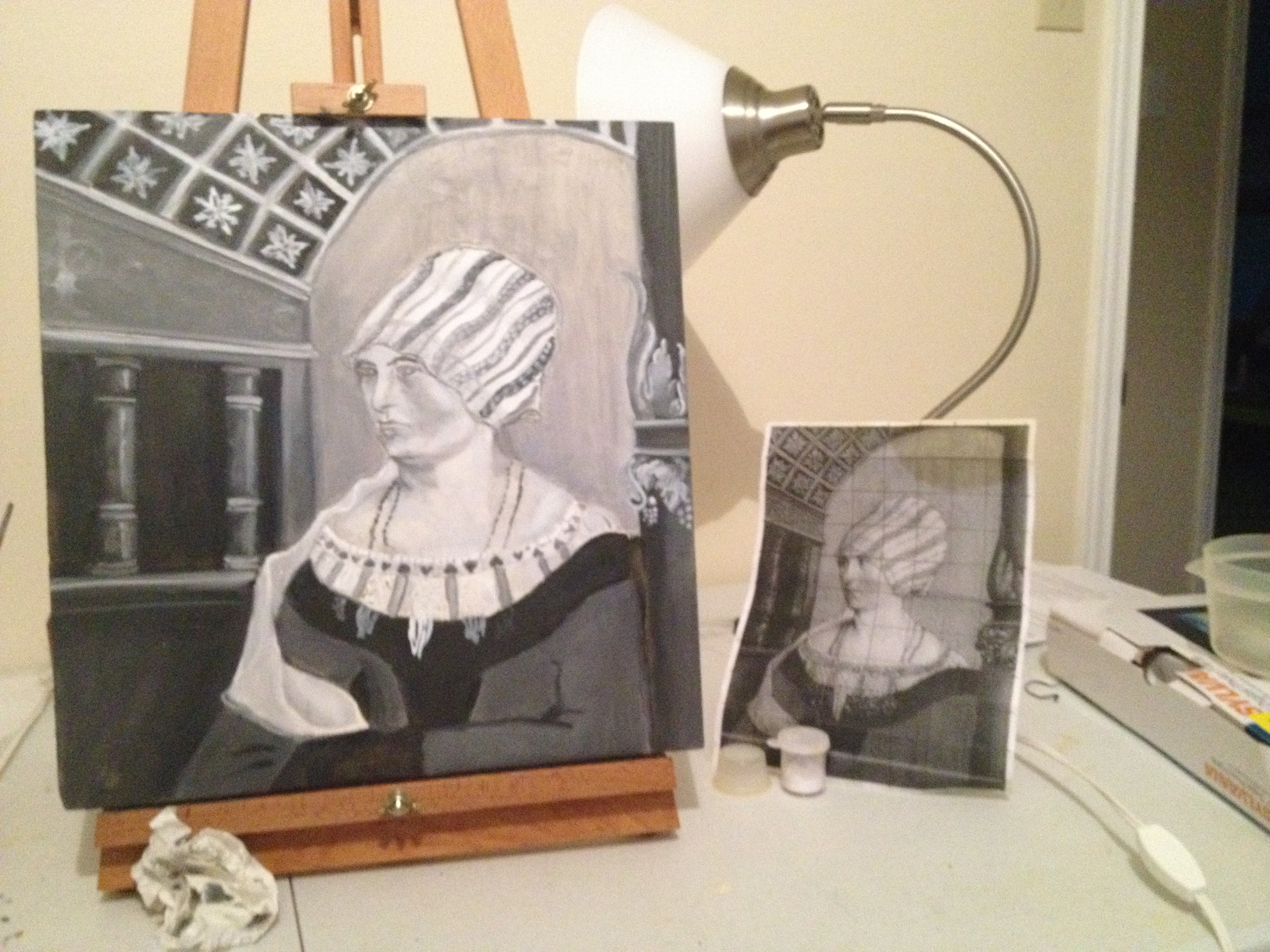
My A & S entry is a based on a painting done by Hans Holbein the Younger c 1497-1543 in 1516 (Dorothea Kannengiesser wife of Jakob Meyer). I had entered this painting as an unfinished work for QPT in 2014 and have left it alone since then until recently.
My goal was to explore the process involved in a Northern Renaissance style oil painting from the 1500’s. In this case I am focused on the Northern European Style used at the beginning of the Renaissance in Germany. In contrast to an Alla Prima style, which is painting in one session, it consists of separate layers of paint: a grisaille under layer, a painted layer (wet on wet), and then layers of glaze. The painting I am focused on is done in a Northern Renaissance style as compared to a Venetian style that was done in the south. The Venetian style used a verdacciio (green earth) under painting instead of the grisaille used in Northern Europe. The verdacciio was thought to give a warmer colour to the flesh tones than that of the grisaille. At the time of Queens Prize Tourney it had a completed grisaille layer. Now it has a subsequent over painting and glazing is applied to add colour, depth, and luminosity.
Materials
Support – Traditionally oil paintings of this time were completed on wooden panels, (oak, poplar or cedar) or canvas. Larger paintings were made on canvas however wood panels were preferred because there was less chance of cracking. The best option was to take a single piece of wood but if not possible planks could be glued together. For this project I used some cedar panels from Home Depot and had them cut to a manageable size. About 15” x 16”
Ground –The type of ground used in oil painting on panel was the same ground used when egg tempera was the common medium. Gesso is a mixture of hide glue mixed with water and boiled with powdered chalk and applied to the panel. After dry it would be sanded and then another layer would be applied. This was repeated until the desired result was achieved, that being a smooth surface for painting. For the purpose of this project I am using some panels that I had left over from a previous project. I had made 5 panels that were applied with a mixture of rabbit hide glue / marble dust and chalk. This was a kit I purchased from Natural Pigments. In much the same way, the mixture was mixed with warm water then applied to the cedar panels. They were then allowed to dry and sanded. It took about 8 coats to make a good finish. However I am seeing cracks in the panels now.
Pigments – Paints from this time were created by grinding a pigment, made of mineral, plant or even bugs, and mixing it with a binder such as linseed oil, walnut oil, or egg. Modern paints contain materials to stop the separation of the pigment and oil, and also reduce the drying time. Traditional paints did not have any added materials for that purpose. They would be made up in small batches and take much longer to dry. I am using pigments from Natural pigments and then grinding them between a sheet of glass and a glass muller prior to making the paint.
During the period I am looking at the pigments commonly used were: [1]
Reds: Vermillion, Madder Lake
Yellows: Naples Yellow, Yellow Ochre
Greens: Verdigris, Green Earth and Malahchite
Blues: Azurite, Ultramarine and Indigo
White: Lead White, Gypsum and Lime White
Blacks: Carbon Black and Bone Black
I have chosen my pigments based on availability. The pigments I am using are (German Vine Black, Titanium White (less toxic than lead white), Ultramarine Blue, Yellow Ocher, Green Earth, Cinnabar, Vermillion, Red Earth and Burnt Umber)
Medium – Linseed oil was the common oil used for applying paint. Other oils such as walnut or poppy were used in areas that could be affected by the darker colour of the oil such as the face or hands or where there was a danger of yellowing.
Dammar Varnish is created by dissolving Dammar resin crystals in Mineral Spirits. It gives a nice gloss to the paint that I like.
Taltine is an odorless solvent used to thin out the paint for brushing and lowers the oil content for earlier layers.
Others – Soft bristle paint brushes were preferred. They applied the paint nicer to the more slippery panel at the beginning. Other materials used were a palette ( I use disposable sheets), palette knifes (for mixing), paper towels, rags and some Taltine for cleaning.
How did you make it?
- Preparing a panel and copying the image
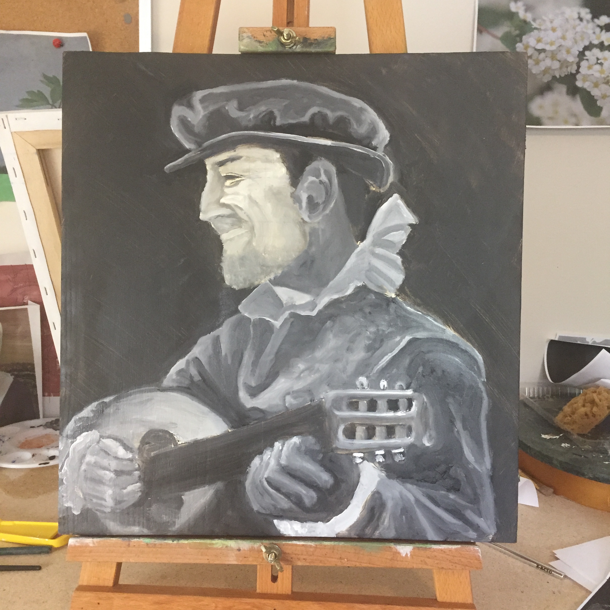
- Grisaille layer – black and white under layer
- Painting layer, wet on wet
- Glazing (thin layers or pigment and medium placed over a dry layer) and Scumbling (adding a lighter colour to a glazed area to lighten it in value)
During the time of Hans Holbein the Younger a great deal of sketching was done to prior to painting. After sketching and preparing the panel, an outline was made in charcoal and subsequently built up with light washes of ink. From this point the under layer was made. The grisaille layer needed to be completely dry before any other layers were applied. Once dry, a wet on wet method could be used, or glazes would be added. Once the layers were completed it needed to dry for up to 6 months, then a coat of varnish would be applied.
Preparing the Panel
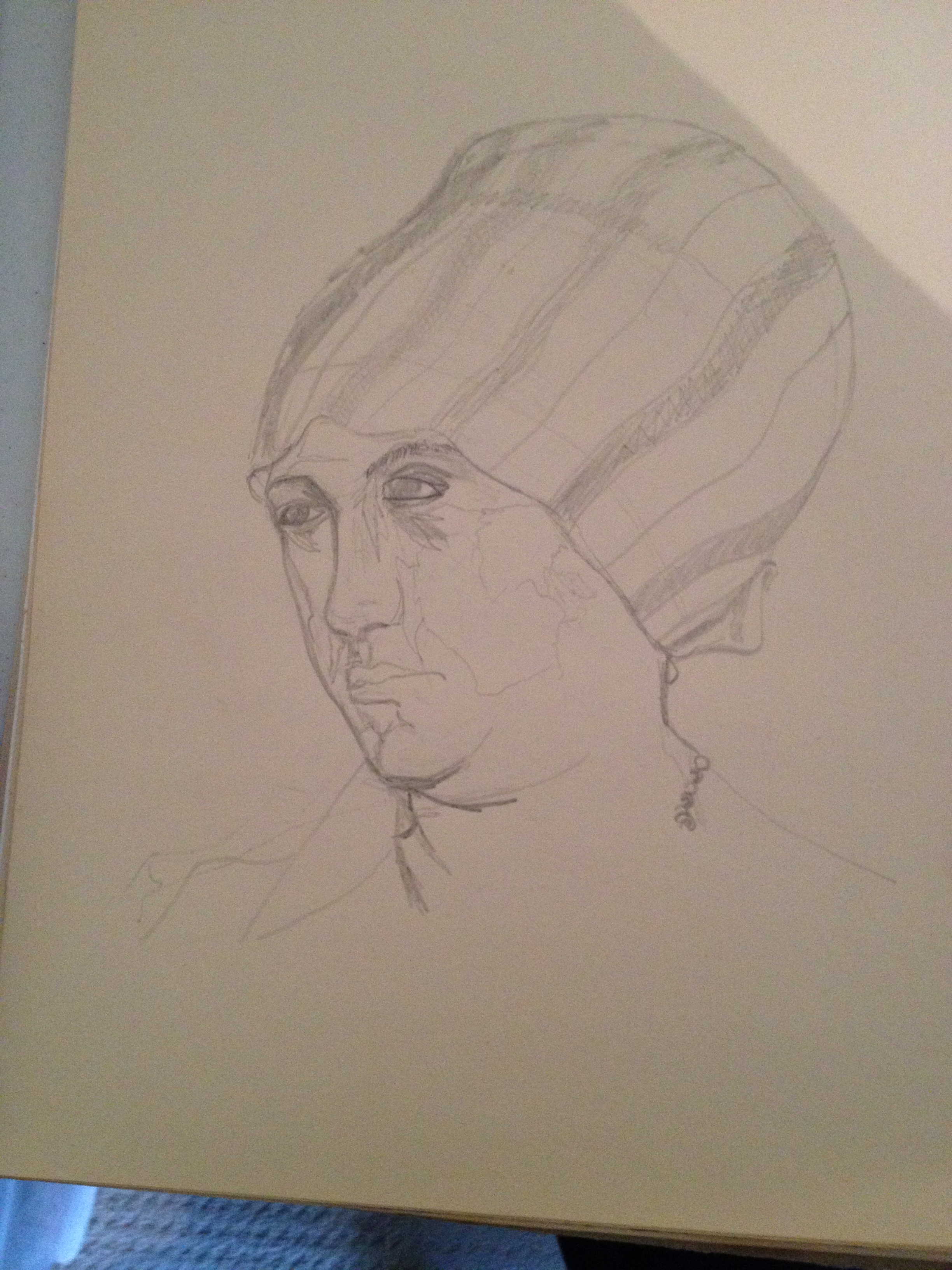
For this project I started with a cedar panel coated with a mixture of rabbit hide glue, chalk and marble dust that I had prepared for QPT in 2014 (see materials) It was nice to have one ready to use. Once I had decided on my image I made a few sketches to understand how to draw it. Then I wiped linseed oil into the panel to help remove any dust from the top layer of gesso and let it soak in. To help keep the drawing closer to the original image I created a grid pattern on the panel and created a grid on a photocopy of the image. I transferred over the image a grid at a time and was able to keep the transferred image truer to the original. I needed to make some adjustments as my panel was wider than the original. So I added in an extra row of tiles on the top. Traditionally an artist would have used charcoal but I was not incredibly comfortable with drawing it out that way so I used a pencil to outline the figure and architectural elements.
Grisaille Layer
At this point I mixed up my paint by putting some white pigment and marble dust on my mixing table. The ratio was 3:1 and added a drop or two of linseed oil and mixed using a spatula until no longer grainy. I transferred to my palette and did the same with the black.
From here I mixed up some gradients of black, grey and white on my palette sheet. The oil medium I use to add to the paint is a 1 to 4 mixture of Linseed Oil and Taltine. The oil gives it the gloss and lengthens the drying time. The Taltine is the thinner, gives the paint a more matte finish and also shortens the drying time. If the ratio of oil to Taltine is high, the paint will take longer to dry and will be glossier. If there is more Taltine the paint will have a matte finish and the take less time to dry.
I blocked out the sections according to values. While constantly comparing to a photocopy I applied the darkest greys to the darkest portions and the lighter greys accordingly. Once the basic values were blocked in I went into more detail in that area. For example the posts and walls were in the darkest greys so I filled those in, and then added lighter greys to highlight the curve of the post, and parts of the sculptured leaves and grapes. After these were on I would add lighter greys (almost white) to the lightest parts of the leaves and grapes. This would continue with the rest of the walls and other elements.
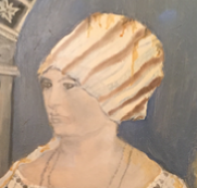
The face was accomplished by lightly adding grey to the shadowed areas of the face and blending with a dry brush. This was repeated until the face shape was built up and the same method was applied to the neck. Very little black was used. After the first shadows were applied I would almost dry brush in some grey, and blend with a soft dry brush. A fine detail brush was used on areas that needed more precise lines.
Painting Layer – Wet on Wet
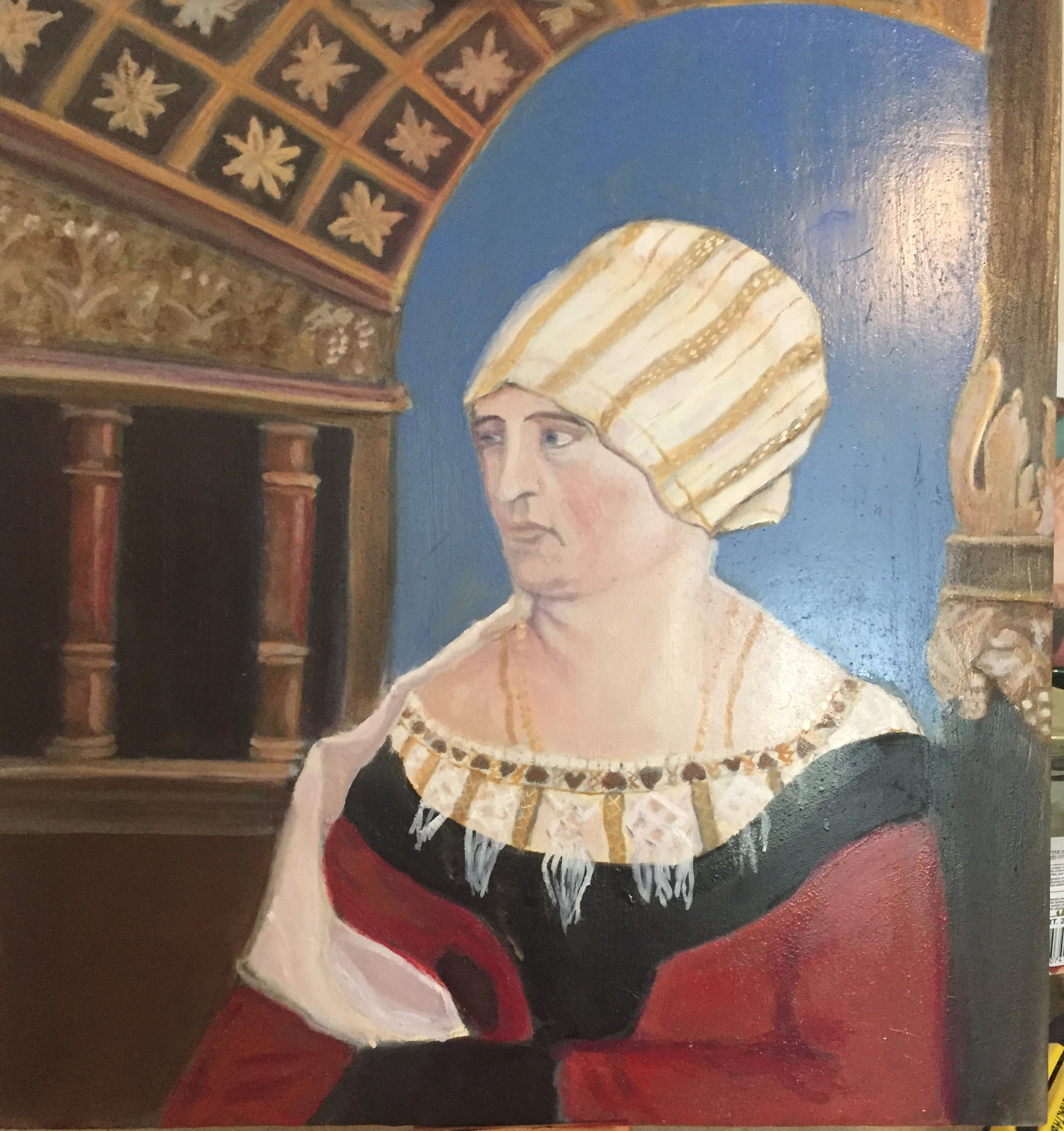
The majority of the colour was done in more of a wet on wet fashion, the face, head scarf, right column were modelled in this way. I started on the head scarf; however I found I was having some problems with the some of the paint bleeding down into a different section. The yellow ochre in the head scarf was bleeding down into the white portion below.
I was concerned and after asking some advice through a Facebook group (Traditional Oil Painting) it was suggested that my medium mixture may have contained too much solvent (Taltine). I was not being very specific with the ratio of oil to solvent at that point, just trying to keep it leaner. Since that point I have adjusted my medium mixture. Currently I am using a 1:1:5 ratio of linseed oil, Dammar varnish and Taltine on earlier layers and the mixture will adjust as subsequent layers are applied with less and less Taltine in each new layer (1:1:4, 1:1:3).
A note about mediums: The reason for the change in the ratio of components is because oil painting layers are based on a fat over lean principle. Early layers must have lower oil content than later ones because of drying time. If later layers take shorter to dry than earlier ones there is the danger of the layers cracking.
After some more reading on an online forum (www.wetcanvas.com) I learned that this could be due to the pigment separating from the oil and not binding properly so I made another adjustment. I purchased a glass muller and plate. I am now grinding the pigments even more prior to mixing. I believe this is creating a smoother texture and also helping to make the pigments bind with the medium better. These adjustments have helped. I have read at the forum that the ultramarine that I was using was a pigment needed to be ground very fine to bind well with the oil. I had a problem with that colour as well as the ochre above.
After I worked on the head scarf I went on to the face. The colours I am mixing for the face are vermillion, yellow ochre and white. I have made the skin colour very light as well as more “pink” to match the image.
The post on the right and much of the lower left and body is done using a wet on wet method. Just mixing paint and shadowing as I tried to decide what colours to apply. The post on the left had a few lines painted on them with lighter ochre so it would show through subsequent glazing.
Glazing
Glazing is the process of taking a very thin layer of transparent or semi-transparent colour (usually darker) and placing it over a lighter colour. The effect is a warmer tone as the colour below subtly radiates through the colour above. “The rich golden glow or Rembrandt’s dark browns were produced in this way.” [1 Virgil Elliot, Traditional Oil Painting (New York, 2007) Page 79, Paragraph 2] Glazing was done to specific sections in a painting to emphasize or deepen colours.
I have used a glaze on the columns on the left portion of the image. I have painted the 2 columns with a yellow ocher and white mixture. Then, once dry, I applied a glaze using the same red as the figures dress over top. My glaze is created using a small amount of mixed paint (pigment and linseed oil) and adding it to a larger amount of medium. I am using a 1:1:3 mixture of linseed oil, dammar varnish, and Taltine. On some other areas I will also use just straight paint and linseed oil on the very last layers. This is then very lightly applied over a section. A red glaze over a green will create a deep shadow. The idea is to optically mix your colours by layering a translucent layer of colour over another. This is in contrast to the wet on wet method where the two different paints are physically combined.
Transparent or semi-transparent colours can be used to make a glaze so choosing paints with that property is important. A white can never be used because of its opacity but if you are not getting the desired effect a layer of white will let you start over and build up the colours again. Another thing to note is that a glaze will always result in a darker value, rather than a lighter one, so to have a section retain any of the highlights there has to be some light brought back into the section. This can be done by either painting the highlights again with some white or lighter colour, or by wiping away the paint over the highlighted sections. The term used for this is Scumbling. Another use for Scumbling was to add a lighter opaque colour over a section. If it is mixed with enough medium to become translucent it can soften textures such as velvet, youthful complexions or peaches as well as atmospheric conditions such as fog. [Virgil Elliot, Traditional Oil Painting (New York, 2007) Page 79, Paragraph 3]
Because I have added no drying agents to the medium the time between applying a glaze is a few days or more depending on the paint itself or environmental conditions (temperature, humidity). If I was using modern paints from the tubes it would be a quicker.
I wanted to treat the upper roof and portions of the architecture on the left with glazing. I needed to make sure it was completely dry, and then I applied a mixture of yellow ocher and my “oiliest” medium, then later a light red colour. I later went back into the star like elements in the center of the squares with a white / ocher mixture to bring them back to the forefront. The posts on the left have been glazed with a light red.
Conclusions
I have done more research since priming the panels a few years ago. I had not sized the panel after preparing them with the gesso and I think that is why my grisaille layers were so heavily absorbed into the panel. I have started another that has a layer of sizing applied made of boiled water and rabbit skin glue. Then I applied a ground of tinted flake white. This is a lead white paint from Windsor and Newton. I use it in a premixed form to reduce any issues with using a dry pigment form of lead. The white is a very lean paint so it works well for an initial layer as well as an added sealant to prevent absorption into the gesso.
I am planning to create some sun thickened linseed oil to use in a future project. The process involves water washing the oil to remove all impurities, then letting it stand in the sun over a layer of water for a few weeks. The end product has a quicker drying rate and is much thicker needed to be thinned out with a solvent.
Glossary
Alla Prima – An Italian term meaning that the painting was made in one sitting, there would be no under painting.
Binder – The substance the holds the pigment together and is used to apply it to the panel. It can be oil, egg or wax
Grisaille – A form of monochromatic under painting using only black and white pigments
Fat over lean – refers to the importance of having each subsequent layer of oil paint contain higher or fatter oil content than a previous layer. This is relevant to the style I am using now as there are distinct layers of paint that are dried in between applications. If the oil content isn’t dealt with in this way there is a higher chance of the paint cracking. In an Alla Prima method of painting it is not necessary as it is all being applied in basically one layer.
Gesso – traditional oil gesso is a mixture of glue (usually rabbit skin) water, and chalk (calcium carbonate) used to create a flexible, yet absorbent surface for the oil paint to be applied onto.
Glazes – the term used for a thin, transparent layer of paint. Glazes are used on top of one another to build up depth and modify colors in a painting. A glaze must be completely dry before another is applied on top.
Ground – a thin layer of paint, applied to a support to make it ready for painting. Or it can reference the whole of the panel prior to painting
Lean – used in contrast to fat in reference to the oil content of a paint.
Pigment – pigment is the substance or powder that makes up the color of a paint. Pigments are either organic or inorganic.
Priming – the application of sizes and/or grounds to a support to prepare the painting’s surface, modify its absorbency, texture and colour, before you start painting.
Scumble – very thin layer of opaque or semi-opaque paint that partially hides the under-layer.
Size – a glue applied to fabric (canvas) or paper before priming to seal and protect it from the corrosive oil in the ground and paint. It’s also used to seal wood panels before painting.
Support – The material that the sizing or grounds are applied to. It can be canvas or panel (in this case)
Under painting – the initial stage or first layer of an oil painting commonly executed using a monochrome or dead color as a base for the composition.
Value – the lightness or darkness of a colour, rather than the actual colour.
Varnish – a final layer that can be applied over a finished painting. A varnish protects a painting from environmental dirt and dust and is removable for cleaning and conservation purposes. Damar is commonly used now.
Verdaccio – an Italian name used to describe a muted earth green used for creating a complete monochromatic under-painting. Often used as a nice base to apply warm, pinker tones on top for portraits.
Water Washing – the process of mixing linseed oil with water and then letting it set in a glass or plastic container. Once the mixture settles the oil is removed from the container, leaving the impurities.
Bibliography
Books
Il Libro dell’ Arte ( TheCraftsman’s Handbook), Cennino d’Andrea Cennini, Translated by Daniel V. Thompson, Jr.
Traditional Oil Painting: Advanced Techniques and Concepts from the Renaissance to the Present, Virgil Eliot, New York, 2007
Web Sources
Janson, Jonathon,” Preparation of the Painting: Support Sizing and Grounding” , Essential Vermeer.com, ,http://www.essentialvermeer.com/technique/technique_support.html
“Painting Surfaces”, OilArt.com, < http://www.art-handbook.com/surfaces.html >
“Renaissance and Baroque (1400 – 1600)”, Pigments Through the Ages , <http://www.webexhibits.org/pigments/intro/renaissance.html>
Penrose, Thomas, “Painting a Copy of Jan Vermeer’s “Girl with a Pearl Earring” Using Oil Glazing Technique and a Grisaille (Monochromatic Gray) Under painting”, Penrose Art, http://www.penroseart.com/vermeer04.htm
“Painting techniques: Van Eyck, Rubens and Rembrandt”, Forums on WetCanvas.Com http://www.wetcanvas.com/forums/showthread.php?t=936651
“The History, Definitions, and Techniques of Oil Painting, with emphasis on its development in the 15th century”, http://ringlingdocents.org/tutorials/historyofoils.htm
Glossary for Oil Painting Terms, The essential Guide for Beginners, http://willkempartschool.com/glossary-for-oil-painting-terms-the-essential-guide-for-beginners/
[1] “Renaissance and Baroque (1400 – 1600)”, Pigments Through the Ages ,<http://www.webexhibits.org/pigments/intro/renaissance.html>

 a play and I didn’t want to miss it so I passed on entering on A & S again. This year the timing seemed to work and I went back to it to finish before the deadline.