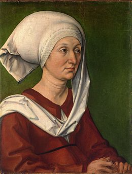
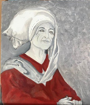
Source: Based on Albrecht Durer’s painting of his Mother Barbara Durer in 1490.
Goal
Create a painting using Albrecht Durer’s painting of his mother as the basis, and incorporating an image of my mother.
Background Information
I chose this painting to be the central focus of my pentathlon entry a couple years ago. Albrecht Durer has always been one of my favorite artists and his painting of his mother always interested me. It was done very early in his painting career and is part of a set of paintings he did of his parents. It is one of his earlier paintings, and is more simplistic compared to the one he did of his father but paintings of women at that time generally were. He had a deep respect for his mother and I see it in the painting. She is not overly adorned, or embellished but does not have that demeaner of boasting piety that I see in other paintings even with the rosary in her hands. The Steuchlin and wulsthaube indicate a certain status with the length, but the dress is very basic. She holds rosary beads in her hands to indicate piety. All in all, I see a person deeply respected by the painter.
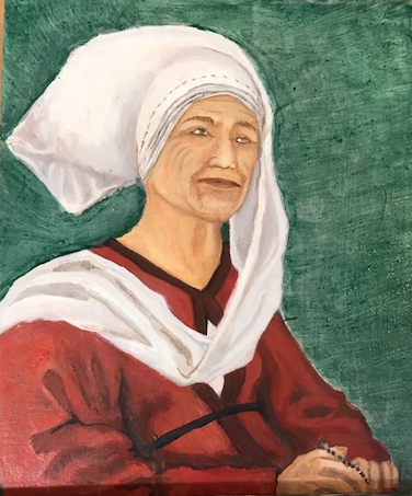
I originally thought it would be nice to do a self-portrait in the clothes that Barbara Durer was wearing in the painting. However, the more I thought about what was drawing me to the painting, the more the idea morphed into another project. I realized that my personal interest in this project was stemming from the passing of my mother in 2017. In ways my mother was similar. I have a deep respect for her and wanted to find a way to incorporate that into my project. I decided to still make the painting but instead of me, make the painting of my mother.
A few notes on my research into the painting…
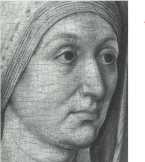
I was very fortunate a few times over the course of this project. The first stroke of luck occurred after I contacted the Germanishes Nationalmuseum in Nuremburg. I was hoping to get some information on pigments used in the painting. They were not able to provide exact documentation of pigments, but the painting of Barbara Durer was featured in an exhibit that was showcasing the early works of Durer in 2012. It had been analyzed with a high-resolution infrared imaging system that allowed them to view the underdrawings. Even better they sent me a pdf copy (translated into English) of the paper that accompanied the exhibit. It contained information on construction of the panels and images of the underdrawings involved in the painting.
My second stroke of luck involved my husbands work trip to Hamburg. I was able to arrange vacation to coincide with his trip and took a train down to Nuremberg to see the painting in the Germanishes Nationalmuseum. This was an incredible experience. The painting was on display in an exhibit on research methods used at the museum so I was able to get many close-up pictures. On top of that I visited Albrecht Durer’s house in Nuremberg. Pigment examples were on display of what was used at that time. This, in addition to a paper on early ‘Methods and Materials of Northern European Painting in the National Gallery, London enabled a pretty clear understanding of what pigments were available during that time.
Construction
Panel
As stated in the paper from the exhibit, some of his other paintings at the time were painted on canvas, but the paintings of his parents were both on fir or linden (basswood). According to the paper, they were butt glued together.[i] (Side note: if you google butt glue joints, one of the first results is “I ate taco bell and glued my butt together”).
The mother’s portrait had a sheet of well used linen cloth over the wood complete with tears and holes in the fabric and was then primed with white gesso. I decided to not use the linen cloth on my panel.
In making my support I used Pine boards since it was more available and pine was a common wood used for supports. Because of the available sizes I decided on making my painting to be roughly ½ of the original size. I applied a size of rabbit hide glue to the panel, and about a week later I applied the gesso.
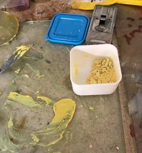
Gesso The gesso was made by heating 1 cup of size in a double boiler and then mixing in a combination of marble dust, chalk or pigment. This was moved through a sieve and applied in layers to the panel, then sanded. (see earlier Panel and Paper Preparation for Pent projects)
Pigments
The Durer house had a nice display of the pigments used by Durer. It was nice to see the different pigments in their original forms. According to the technical bulletin from the house, Durer has said that he did not follow Cennini. However, he would have used the pigments available for him at the time. In the National Gallery in London released a paper on their collection which lists the pigments found in their collection of Northern European paintings from 1400 – 1550. [ii]
Investigation of the paintings showed that azurite was the most commonly used blue pigment; the use of ultramarine was less widespread, with a very limited use of indigo and smalt. The green pigment verdigris occurred almost universally, but malachite was less common and the ways in which green-coloured mixtures were composed changed over time. Vermilion and the red lake pigments occur in almost every painting, as do lead white, lead-tin yellow, the ochres and other iron oxide pigments and different forms of black, but the ways in which they were employed varied slightly list the pigments available to Artists of that time
In this Painting I have used the pigments below. There are some substitutions that were made for either cost or safety reasons. But since I have better safety equipment now, I have tried to use what I could aquire. All pigments were mixed with either walnut oil or linseed oil, and the colour layer and some had a few drops of mastic resin added to the grinding stage. Mastic resin was mentioned in the Strausberg Manuscript. It says to add 3 drops of resin when making the initial paint, not as part of the medium. The Strausberg Manuscript is similar to Cennini’s Il Libro Del Arte however it was made in Germany and contains more information on the making of the paint for both illumination and oil painting. The mastic is added to the paint in the colour layers, not the under layer.
Safety note: For any of the lead or more toxic pigments below I have used a respirator when grinding or mixing the paint (Verdigris, Lead Tin Yellow, red lead and Vermillion). I use disposable latex gloves for painting with these colours, and my Lead white paint is from a premixed tube to avoid having to grind it too often.
Blue – Afghanistan Lazurite, a component found in Lapus Lazuli which was ground down into ultramarine blue. These are used, mixed with madder to make purple for the shadows in the dress. Used this as I had it available, and the Malachite was very expensive.
Green – Verdigris is a pigment that was created from dipping copper plates in vinegar and enclosing then in a container. The greenish blue substance that was building on the plates was scrapped off and made into a pigment. I made 4 batches of this pigment (see Verdigris) and then was mixed with a lake made of saffron and then glazed over the background. See supporting documents if you want to see more on the creation of the verdigris.
Reds – I have used madder as well as vermilion and a tiny bit of red lead. This is in the dress and in some of the flesh tones.
Yellows – Yellow Ochre and in parts saffron. It is used in the flesh tones and to soften the verdigris
Browns – Burnt Umber used to get some flesh tones and darken some areas of the dress.
Whites – In the grisaille layer, I used Titanium white, the background has lead white mixed in with the black. It is used in the flesh tones and highlighting areas.
Black – German Vine Black. Used in the underlayer to make the grisaille.
Under drawing
In preparation of the painting I made sketches of both the painting, my mother and a combination of both in silver point. These sketches formed the basis of the underdrawing and can be seen in the silver point project.
Silverpoint was used sometimes for the underdrawing on the panel, but the infrared image is clearly an ink under drawing as was common at the time.. I can see clear brush lines in the infrared image of the body and the face.
The under drawing is made using oak gall ink. I made the ink using Oak Galls from a tree in our yard. It was not as dark as needed for calligraphy, but worked great for the under drawing. In looking at the infrared images I have used both a brush and feather quill to draw as I see lines that could be make both ways.


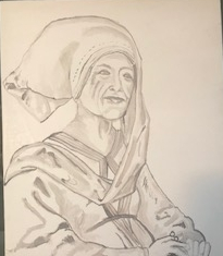
To transfer this Layer I printed out a copy of the image that was the same size off the painting and transferred the basic outline to the panel using conte crayon. The chalk is rubbed on the back of the image, then the image is placed on the panel. The out lines are drawn over rather hard and it transfers the conte crayon to the panel. After, I drew over the chalk lines and added in more detail using my oak Gall Ink. From there I worked more shading using a brush and lighter amounts of ink to fill in the background. This painting of Durer had more detailed underdrawings than later paintings. So I did more than just the outline.
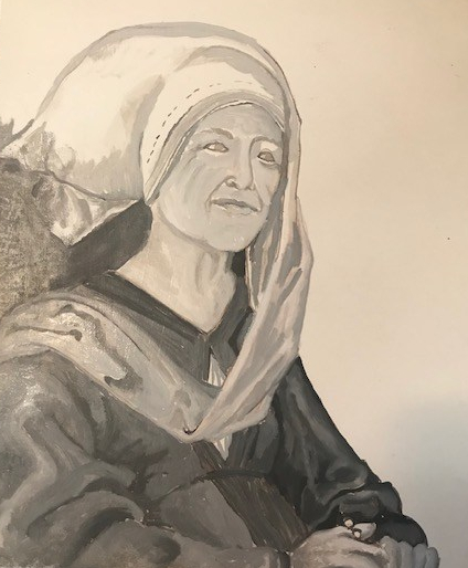
Under Painting (Grisaille)
For the underpainting I prepared varying values from whitish-grey to dark grey using titanium white pigment and German vine black mixed with linseed oil. For the background I used flake white (tube of paint) in the hopes it would provide a nice base for the verdigris that would go on top of it later on. Flake white is very reflective. I then set it aside to dry as I worked on other projects.
Color Layers
My approach has refined over the last few paintings. I choose one section at a time and make all the colours I need to finish that sections. I try not to hop around too much.
Dress I started by doing the red dress. To start, I mixed up some vermillion and painted over the whole section of the dress. After that I made up some madder, mixed up with some ultramarine blue to make a darker burgundy colour and laid that down n the shadows. To brighten up the lighter sections of the dress I added a bit of red lead to move the colour to more orange than bright red. After that I added some lead white mixed with the red lead and laid it down around the darker shadow areas, then used a a bit of lead white to work in the highlights. After I was happy with it I let it dry for a while and added in the black belt when I know it wouldn’t blend into the red paint.
Veil I see the veil as being mostly white with a mix of purples and reds in the shadows being picked up by the dress and the green background. At first I used the flake white, but it was laying down a little too transparent so I switched back to a titanium white which seemed to cover better. I used the same paint mix I used for the dress shadows (vermillion, ultramarine blue) and mixed it with the white to make the folds in the veil, darker shadows used less white. It still took a few layers to cover up the under painting.
Face and Hands
This was a mix of the vermilion, yellow ochre and lead white of varying values I started with a medium value, painted the darker areas, then used a lighter mix and did the lighter areas and so on. It took lot of going back over areas and building up lighter ones. I did not glaze this portion.
Final Touches
After the rest was done I added in the belt, rosary beads, sharpened up the areas where the one object met another, for example neckline of dress, veil and face etc…
Background
The background is a mixture of verdigris and saffron. The verdigris was made and the process can be seen here.
The Saffron pigment was made by using saffron stems soaked in water overnight. The next day filtered the liquid though a coffee filter into a glass jar. Then I heated 1/2 cup of water and 1 tsp of alum and it to the liquid. After this I added in 1 tbsp of marble dust. It bubbles up and then was washed a few times by letting it settle, take the liquid on the top off and adding more water. This is what the pigment looked like after it dried up.
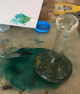
After grinding with a muller, I treated them like the other pigments and applied to the panel. The final background was a nice green from the mixture of the two pigments above. Very happy with the color, unfortunately didn’t have a lot of verdigris to get as much coverage as I wanted.
Sources:
[i] Durer as Painter: The Early work up to 1505, Daniel Hess, Oliver Mack, Translated by Lance Anderson, p 172
[ii] National Gallery Technical Bulletin Volume 18, 1997, Methods and materials of Northern European painting in the National Gallery, 1400-1550, Rachel Billinge, Lorne Campbell, Jill Dunkerton, Susan Foister, Jo Kirby, Jennie Pilc, Ashok Roy, Marika Spring and Raymond White (https://www.nationalgallery.org.uk/upload/rtf/methods_and_materials1997.rtf)
